POSTER DESIGN
Burlesque Posters
Promotional posters for a burlesque collective.
I led promotions for BCU Burlesque during university, managing content and social media. This attracted attention from 'Clumsy Cabaret', leading to a 3-year collaboration creating event materials.
This side hustle of promotional posters has been a great opportunity to explore colour palettes, illustration styles and fonts I want to experiment with while helping bring attention to a small cabaret club.
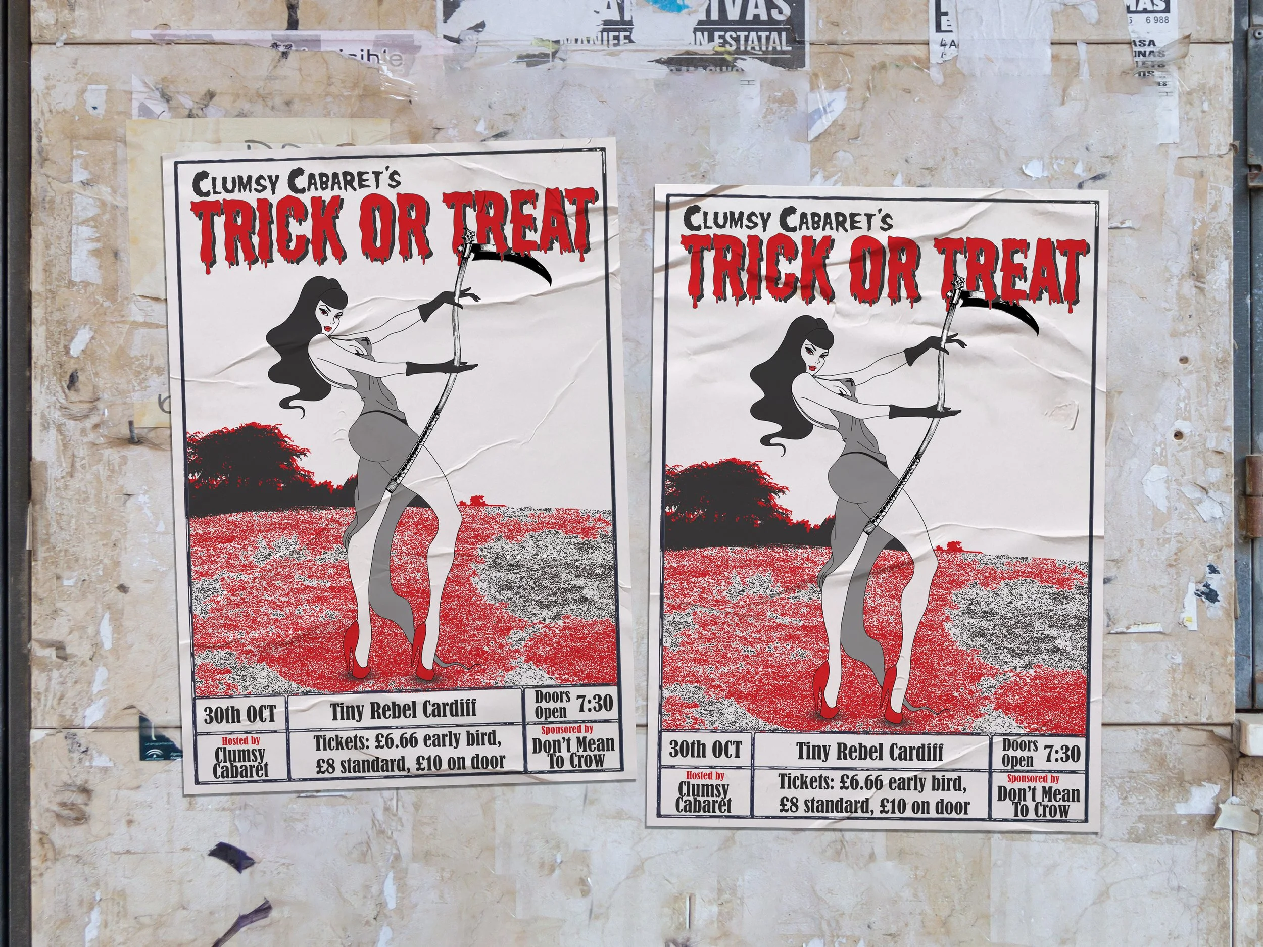
Halloween
The concept for my design was sparked by tarot cards, blended with the effects of risograph printing. To strike a harmonious balance and prevent visual overload, I opted for a limited colour scheme harmonising with the intricate textures. The timeless allure of black and red emerged as the ideal palette, infusing the design with a touch of Halloween's bold mystique. My favourite part of this design is the font choices. I believe they are highly complementary and further communicate the Halloween feel.
Valentine’s Day
I had been eager to use this particular colour palette for a while and felt it was perfect for Valentine's Day. I drew various Valentine's Day-themed characters and concepts, and I came up with the idea of 'Saints and Sinners'. Although we typically associate Valentine's Day with cupid and angels, it's also linked to lust, which is one of the seven deadly sins.
I found it fascinating to explore how both angelic love and devilish lust have power over Valentine's Day. Considering the context of a burlesque show, incorporating lust into the poster was fitting.
May 4th
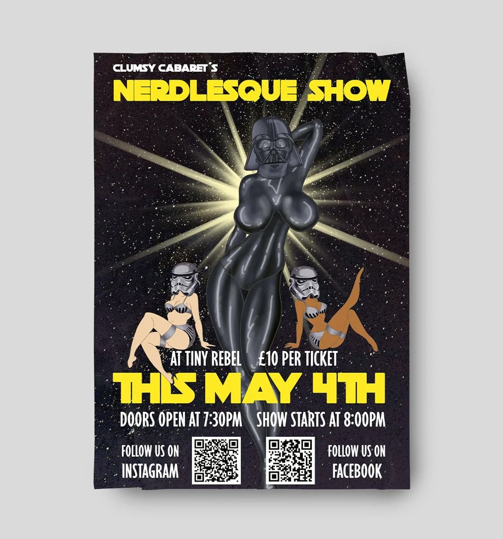
The owner of the Clumsy Cabaret approached me with the idea of a 'Nerdlesque' themed show on May 4th, which is a celebration of the inner nerd in everyone.
Camp comedy is a large part of burlesque shows, so I created a 'sexy' Darth Vader with heavily exaggerated features to turn heads. I believe the poster effectively communicates the humorous and flirtatious performances that audiences can expect to watch.